You invest a lot in digital marketing campaigns, but that would all go to waste with a poor landing page with a high bounce rate and low conversion rate.
There is lots to consider when selecting or creating a landing page for your campaigns. Does it align to your objectives? Is it a good experience for users? Does it represent the brand well? Is it likely to convert your users, create leads and lead to sales?
Here are a few key tips to ensure your landing page is successful.
3 Key Tips For a Great Landing Page
1. Focus on a single goal or objective
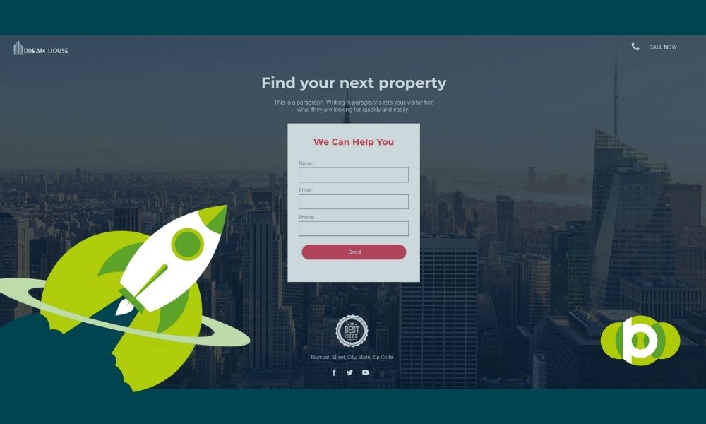
You need to be clear what action you want the user to take. This will dictate the design, the content and the call to action. Don’t try to do too much on the page.
Avoid distraction, gimmicks and confusion.
The more options a user has, the less likely they are to make the choice you’d like them to.
The most common distractions and off topic killers are:
- Too many options – presenting multiple products or services on one page. Which one do you want the user to engage with? Cut out the options and focus the page on one product or service. Create multiple landing pages if necessary and be more granular with your campaign targeting.
- Sign up buttons – these are great to building audience lists for your email marketing and CRM, but if you’re wanting users to enquire via a form, make a call or place an order, sign up buttons can get in the way.
- Videos – Videos are great for engagement, but they can occupy the users attention away from your main focus. If you’re using a Youtube or Vimeo embedded video frames, one videos links to another. Suddenly you’re not getting the attention of that user back.
Make your core action area the lead focus, clean and simple.
Align your creative and content
Use imagery, headlines and copy that compliments and amplifies your message.
Images that are out of tune with the page can be a distraction themselves, use assets that promote the product or service and support the sale.
Good copy can make the difference for driving action. Make the messaging clear, concise and impactful. Over explaining, muddled writing or confusing language is off-putting. Make sure any copy is supportive.
A clear call-to-action
Make any actions clear and obvious on the page. Remove any doubt from the user on what their next step or action should be.

2. (Page) Speed is of the essence
We know that slow loading pages are the biggest barriers to conversion. The simple fact is that everyone’s attention span is reducing and with each extra second your page takes to load, the more users you’ll lose. But if user expectation isn’t enough , Google takes page speed seriously too, with it strongly considered to be one of the key ranking factors for search engine rankings.
Now we’re not going to get into all of the specific measures you can take to improve page load speed, that is for another day, but there are some areas you can look at addressing if you feel improvements are needed:
The platform –
Images and files size –
Scripts & tagging –
There are countless other (very technical) areas that can also be looked at too, such as server capicty, redirects, caching etc. All of these areas are important, but some areas are easier to fix than others, so pick and choose your battles.
If you’re interested in understanding the page speed performance of your current landing pages, there are a range of testing tools you can use to measure your page speed, including Google’s own Page Speed Insights Tool.
3. Beware of the fold
The “fold” is the lowest part on a page visible on screen before needing to scroll down. Your content is either above the fold, or below the fold.
When creating a landing page, paying attention to the fold is crucial. The important information, imagery and call to action should be above the fold if you want to drive quick action. Asking users to scroll to find the content they need or button to click is an extra hurdle that not all of them are prepared to take on. Adding more content that is immediately available is a surer way to keep their atttention.
There are alternatives, should you be limited in your design, for example because of a fixed header size. You can create buttons at top of pages or floating on the side (like our contact widget) to link users to the area on the page further down where forms or other content is located. This is called anchoring, and this can overcome the fold.

Summary
There are lots of design and functional considerations you can make when plotting the ideal landing page for your digital marketing campaigns. The importance of identifying what works for your target audience can’t be understated. Sometimes, that requires some testing.
Hopefully the tips we’ve provided can give some guidance on the areas that can be addressed on your pages.
For more information about our landing page services check out our service page or get in touch via our contact us page.